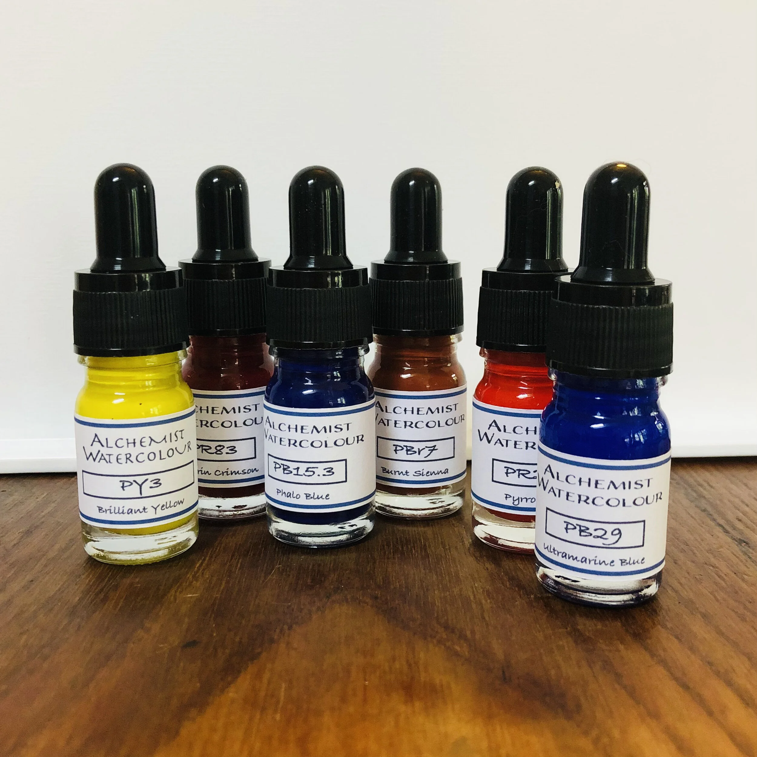
Pigment Codes – are they useful?
What do I mean by pigment codes? Codes such as PB29 or PY43 are often listed within the fine print information on a particular paint, but the tiny print is easy to ignore or just not notice unless you are looking for them.
Watercolour paint manufacturers market their paint colours predominately with their names, some are ubiquitous, such as Ultramarine Blue or Alizarin Crimson. Others are much more esoteric like Daniel Smith’s ‘Moonglow’ or Windsor and Newton’s ‘Davy’s Gray’. The more detailed information will usually identify the pigment code, or sometimes a number of codes where more than one pigment has been used in the formulation of the colour.
When I first began painting I certainly ignored these codes assuming that they were technical data that I didn’t need to know about. However, over the past couple of years, and certainly since I became interested in making my own paint, I have become intrigued with the pigments used, where they come from and what the differences are. I have found that knowing about the pigments has actually helped me to become a better painter, this and the ‘where they come from’ comment - I will come back to a little later in this blog.
In case this is a new subject for you, I’ll give you a quick run down on what the codes are and what they mean. The letter ‘P’ at the beginning of each code merely stands for Pigment. The next letter, or occasionally letters, refers to the colour family, for example, ‘R’ for red or ‘B’ for blue or ‘Br’ for brown. Following the letters there will be a number which denotes the specific pigment used. So taking a couple of examples; PB29 Ultramarine Blue - Pigment Blue No.29, PR83 Alizarin Crimson - Pigment Red No.83 or PBr7 Burnt Sienna - Pigment Brown No.7.
So this breaks down what the code means but why is it useful to us? There are a few answers to this question… but mainly, if you are looking at a particular watercolour paint or a brand that you are not familiar with, checking the pigment codes may tell you how well a new colour might add to or fit into, your current palette. This is particularly true where the paint is a mix of more than one pigment, not only because you may decide that you can easily mix the colour from paints you already own, but also occasionally, you may get some nasty surprises… I will give you an example here, I purchased an ultramarine blue watercolour paint - what could possibly go wrong I thought!! I was in a hurry in the shop and it wasn’t a brand I knew. So I just tried it. I couldn’t work out why I was having so much trouble mixing with it and why, when dry on the paper it didn’t have the warm blue appearance that I was expecting. Honestly, I thought I was going mad, mixing muddy messes instead of beautiful neutrals and producing this too vivid, cooler, more staining blue in its mass tone. Looking at the pigment code explained all - it wasn’t a single pigment, true ultramarine blue (PB29), but a mixture of PB15 and PV19. I might have just thrown the paint away - well actually that’s a lie - I never throw paint away!! But it would have likely been one that just languished in my drawer and never got used again… but knowing that it was actually a mix of ‘cool’ phalo blue and a quinacridone violet helped me to understand how I might use the colour and more specifically how not to use it, for example, mixing with burnt Sienna doesn’t result in a subtle dove grey and wouldn’t make anyone happy!
Before I leave this subject I do want to cover off where this seemingly simple and useful system appears to completely fall apart! You may already have noticed that some pigments appear to be used for very different single pigment colours, even within the same manufacturers colour chart. So what’s going on there and does this mean that the whole system is useless? It does make the subject a bit more complicated - no surprises there in the watercolour world - but there is a logic to it and the advantages mentioned above still stand true for me. The reason is that some common pigment codes, for example PBr7, are the base pigment for a range of colours such as Raw Sienna, Burnt Sienna, Raw Umber and Burnt Umber to name a few. The pigment historically was made from natural iron oxide clay but now is mostly made from synthetic iron oxide powders and may be considered as a convenient colour designation rather than a technically exact pigment description. Where a pigment might be described as a ‘genuine mineral pigment’, such as the Daniel Smith range of that name, it is still necessary to understand the country of origin, since this is a natural earth substance and is unlikely to be exactly the same across the world. You may have seen green paints that are specifically named for their country of origin - a Cyprus green… Given this situation - are pigment codes still useful to us? I very much believe that they are. The examples given above still hold true for me and I still use knowledge of pigment codes to inform my paint and pigment purchases and in my art practice to assist me with mixing and using colours in my painting.

